Olfactory: Fragrance E-Commerce
A fragrance e-commerce website for users searching for their niche fragrance. Made for those who want to explore both feminine and masculine scents. Featuring personalized recommendations and detailed scent descriptions to make the online fragrance shopping experience easier.
Form Factor: Desktop (1440x1024)
Approach: Lean UX/Agile
Duration: 8 weeks (Fall 2023)
Tools: Figma, Figjam, Teams
Role: Interaction & UI Designer
Team Size: 4
Goal: Help users find their niche signature scent online

Introduction
For this project we referenced the book Lean UX by Jeff Gothelf and Josh Seiden. Gothelf and Seiden define Lean UX as “a design approach that brings the true nature of a product to light faster, in a collaborative, cross-functional, and user-centered way.” (10). In lean UX, requirements are recognized as assumptions. Since human behavior is unpredictable, the best we as designers can do is assume what the user needs. And then we test those assumptions and make adjustments based on user feedback.
Instead of learning about the product and then designing it, the process of Lean UX does these simultaneously through sprints. In each sprint the design team completes the lean UX canvas, and this canvas acts as a guidepost for the direction of the project. The lean UX canvas “brings together a series of exercises that allow teams to declare their assumptions about an initiative.” (33). The lean UX canvas is comprised of 8 parts:
1. Business problem statement
2. Business outcomes
3. Users
4. User outcomes & benefits
5. Solutions
6. Hypotheses
7. What’s the most important thing we need to learn first?
8. MVP’S & Experiments: What’s the least amount of work to learn the next most important thing?
Our project was comprised of two 3-week sprints and 2 weeks of refinement time, equaling 8 weeks total. In the first week of the sprint, we complete the canvas and determine our backlog of tasks. In weeks 1 and 2 we create MVP’s (minimum viable products) and conduct user interviews. During weeks 1 and 2, the team has stand-up meetings every two days to make sure tasks are completed on time and that the team is on the same page. These steps are then repeated in Sprint 2. A more detailed look at the schedule can be found below.
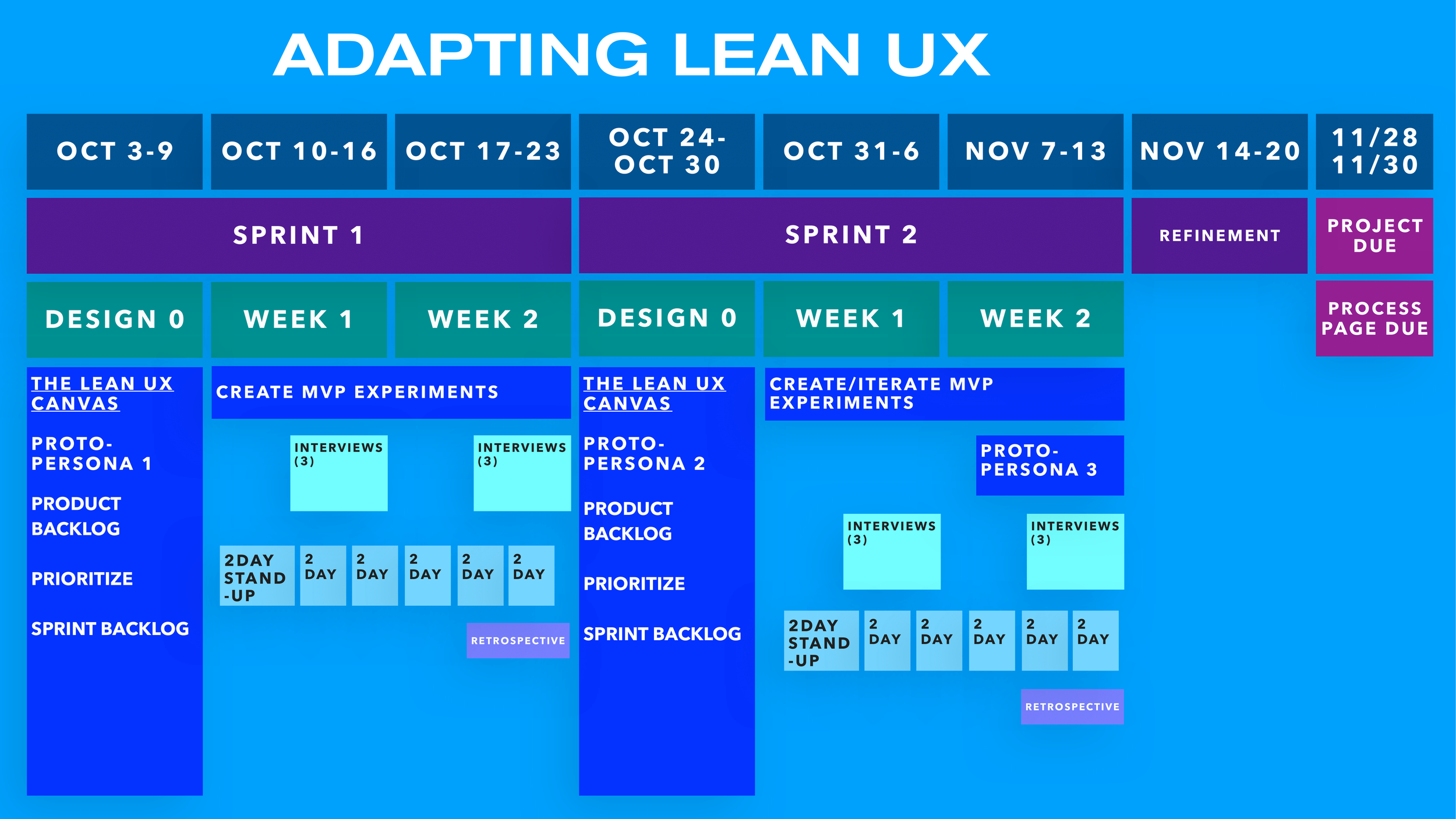
Figure 1. A schedule/overview of the project
Our Lean UX Canvas
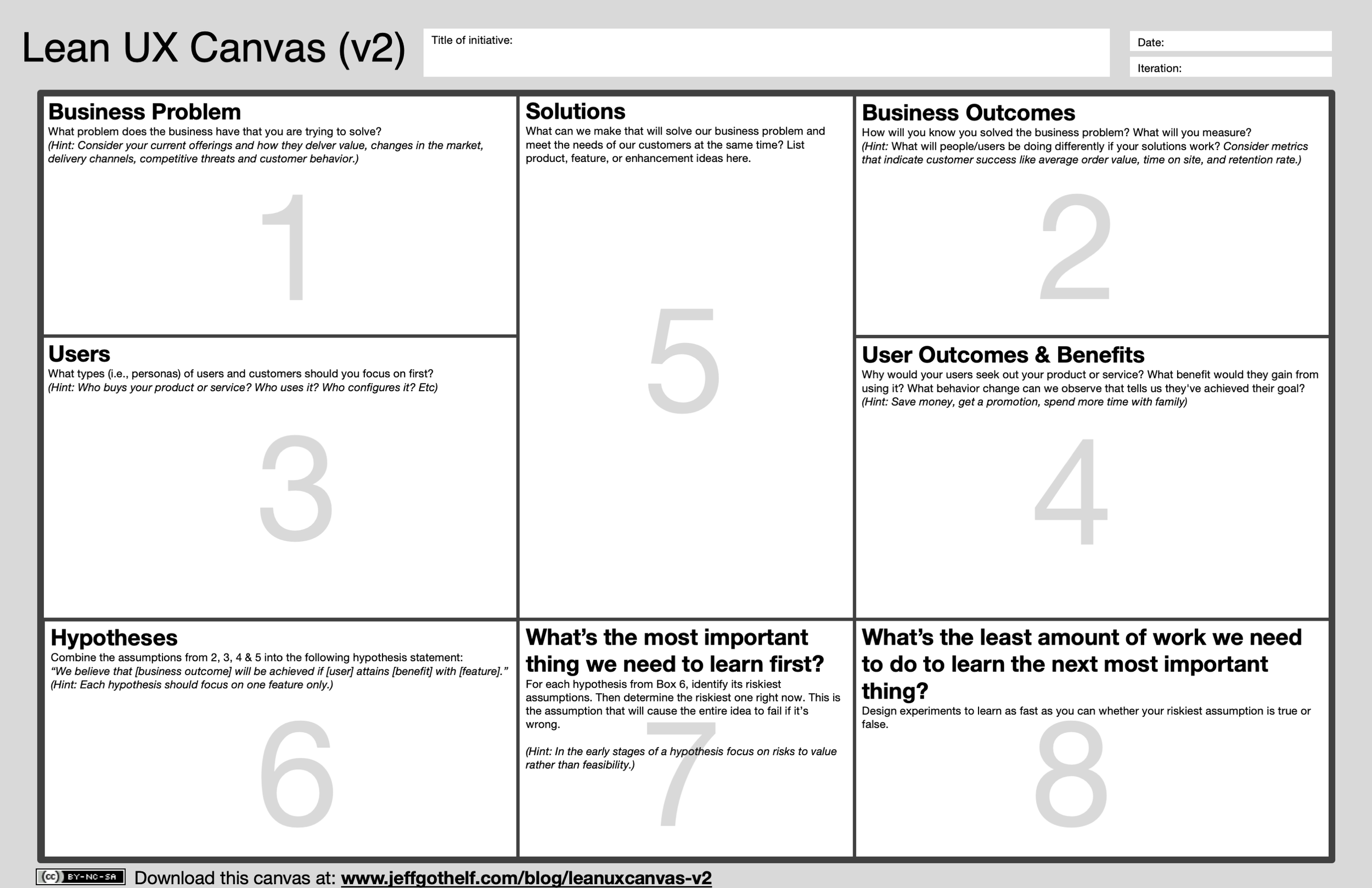
Figure 2. Lean UX Canvas
1) Business Problem Statement
As a team we made assumptions about the current state of the domain we were entering and then made a problem statement based on these business assumptions.
Problem Statement:
“The current state of fragrance e-commerce has focused primarily on selling the most popular designer brand fragrances without any regard to the users’ preference. What existing products/services fail to address is personalization, inclusivity, and detailed fragrance descriptions. Our product/service will address this gap by educating the user on fragrances while deconstructing gender binaries and class status. Our initial focus will be on users who want to find a unique signature scent. We'll know we are successful when we see high sales and low returns.”
2) Business Outcomes
Next, our goal was to figure out how we’ll know we’re successful. What user behavior will indicate our success? In short, we decided our metrics of success would be few product returns and gaining new customers. We’d be able to measure this by the amount of purchases being made, positive reviews left, and the number of customers making an account.
3) Users
In this step, we created proto-personas based on our assumptions of who will be using our product and why. We came up with 2 proto-personas: Stacey Brown and Noel Harrington. Stacey is an avid fragrance collector, while Noel is new to the world of fragrance and looking to dive deeper. You can read more about the personas below
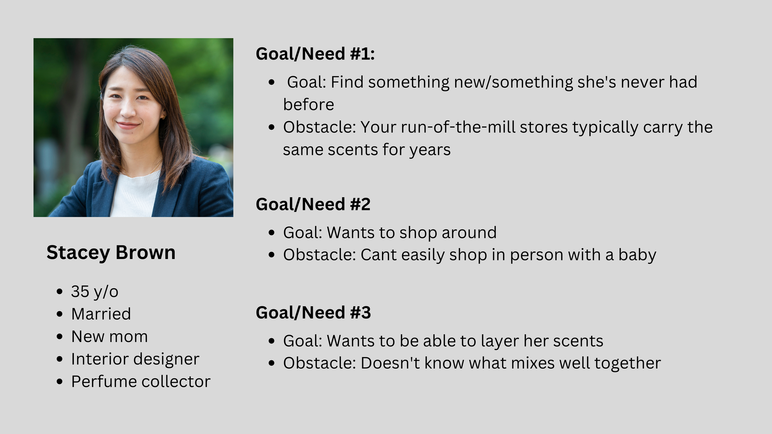
Figure 3. Proto-persona #1 Stacey Brown

Figure 4. Proto-persona #2 Noel Harrington
4) User Outcomes & Benefits
Next, we aimed to answer the questions: Why would users seek out our product or service? What benefit would they gain from using it?
We assumed that our user is trying to accomplish:
Finding a unique fragrance for themselves
Discovering new scents
An online shopping experience that mimics an in-person shopping experience
5) Solutions
We then asked ourselves; what features could we implement to help users reach their goal of finding a new unique fragrance? Our solution that would set us apart from other products would be detailed scent/note descriptions and personalized recommendations. This would be achieved through various features that we came up with such as, a quiz, a virtual assistant, a favorites page, and a layering recommendations section.
6) Hypotheses
Taking all the information from the previous steps, we then combined them into unified statements or hypotheses. This gives us the full context of how the product will be used. Here are some of our hypotheses:
We will achieve few product returns if Noel or Stacy can find a unique fragrance with the onboarding quiz
We will achieve an increase in new customers if Stacey can discover new scents with layering recommendations
We will achieve few product returns if Noel or Stacey feel catered to with the favorites page
7) What’s the Most Important Thing to Learn First?
Next, we ordered our hypotheses by riskiest to least risky. The more risk, the faster we as a team should learn/test the hypotheses to validate it. This order helps us determine what MVPs and experiments to prioritize first.
8) MVPs & Experiments: What’s the least amount of work to learn the next most important thing?
An MVP, or a minimum viable product, is an early basic version of a product that gives users the minimum necessary requirements to interact with the product. The idea is to make a basic rendering of an idea, put it out, get user feedback, and then improve upon it. We decided that the entry quiz and visual note descriptions would be our first MVPs to test.
Sprint 1
In our first sprint we focused on user interviews and establishing a style guide for the brand.
We conducted five interviews and affinity mapped common themes after every interview. Before we began building anything we wanted to understand our users better. So, our interviews were question-based with no testing of any MVPs. We asked things such as; how often do you shop for fragrance? How knowledgeable are you about fragrance? Have you ever bought a scent you didn’t like, what did you do? The answer to these questions informed us which features our users valued.
As for the design, we wanted an aesthetic that was gender neutral, minimal, and editorial. We decided on nude tones and white to help portray this feeling.
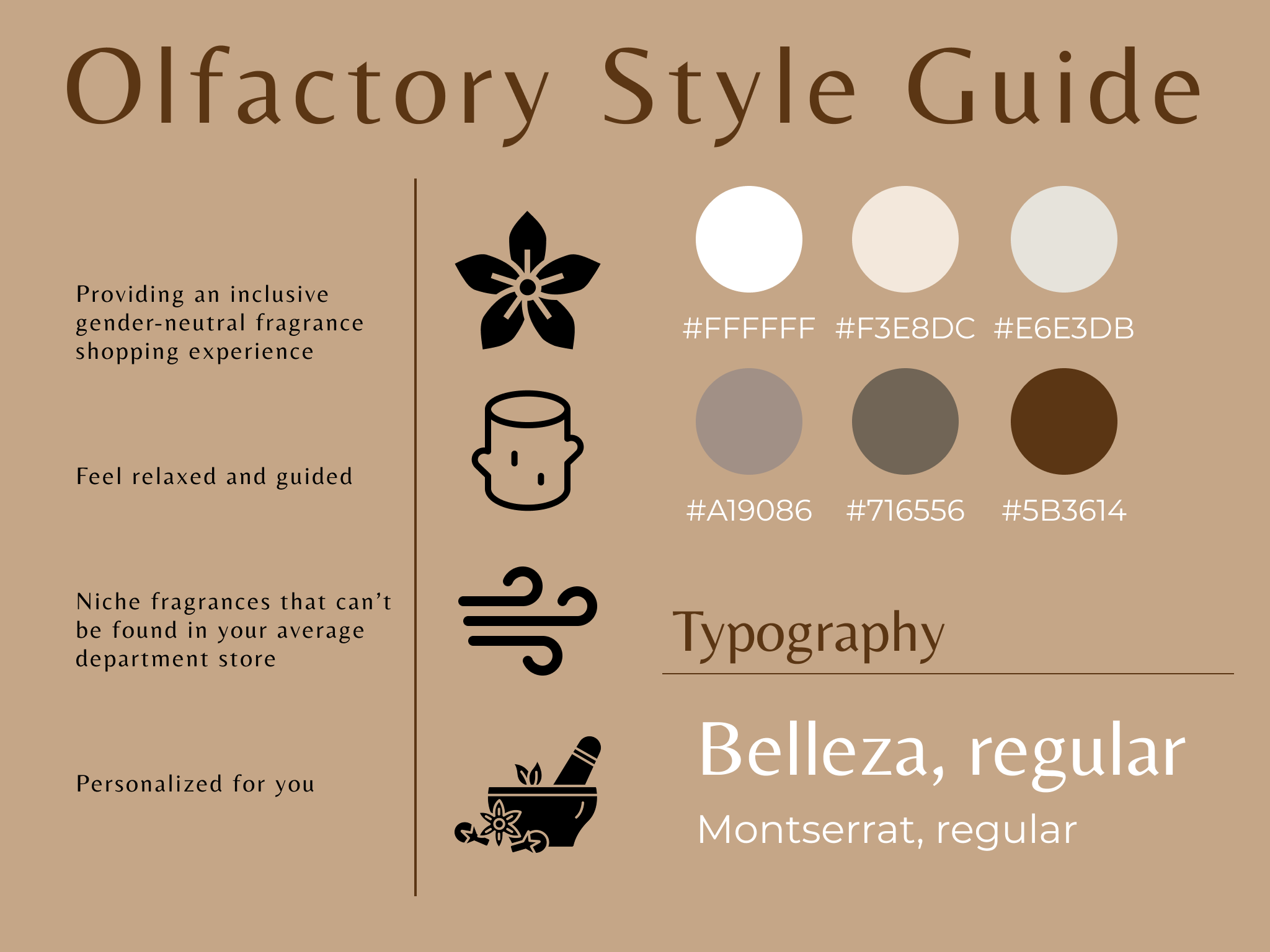
Figure 5. Project style guide
Sprint 2
In sprint 2 we began prototyping in Figma. I was assigned to work on the quiz section of our website, but I also helped the team by creating a design system so that way our project could be easily scaled. I created main components like product cards, buttons, icons, and the navigation bar.
I supported my team’s strong skillset in visual design by bringing on my technical knowledge of prototyping. Taking the base design they created in Figma, I would then go over it using auto-layout adjusting padding, width/height, and space between items. Once done, I would then turn the specific design element into a component. Components allow all members of the design team to drag-and-drop instances of the same element, ensuring visual consistency across all screens. If any change needed to be made to product cards for example, we simply had to edit the main component which would edit all instances of the product card in the project.
We conducted 5 usability tests on the MVP, the quiz, as it was the section of the website with the most interactions. Our goal was to test if our product was user friendly and accessible. For example, could users interact with the product smoothly and without confusion, were buttons/icons clickable, or did text have enough contrast to be readable? We watched the user interact with the product with minimal to no instruction from us. And we observed any difficulties they had with the product. Taking the information gathered from our usability tests, we continued to iterate upon the design during the refinement period.
Conclusion
Over 8 weeks my team and I created Olfactory, a fragrance e-commerce website which assists users in finding their perfect scent. Through this project I was able to get hands-on experience of the lean UX design process. At times it was challenging to keep up with such a fast-paced process; there were certain features we couldn’t fully see through, and some we had to cut for time’s sake. However, being on such a time constraint taught me to prioritize my tasks better and to “cut down the fat”. I plan to take this invaluable hands-on experience into my future projects.